


 Your new post is loading...

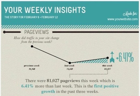

Wouldn’t it be great to get weekly website performance updates as a simple, easy-to-read graphic?
Now you can go beyond the Google Analytics dashboard with a new creative – and free – tool by Visual.ly. The New Google Analytics Report automatically delivers an infographic depicting your favorite metrics right to your desktop. See the infographic at the article link for a sample of a full infographic that is generated...
Via Lauren Moss


Præsentér ledelsesinformation i GRATIS designet dashboard med gnaske få klik