ED 262 KCKCC Sp '24
1.2K views | +0 today
Follow
Your new post is loading...
Scooped by Dennis Swender
Scoop.it!

The Two Koreas

The Two Koreas | ED 262 KCKCC Sp '24 | Scoop.it

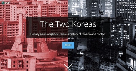
"While the Korean War of the early 1950s never formally ended, its aftermath has created starkly divergent worlds for those living on either side of the north-south divide. What follows is a look at life in the two Koreas; how such a night-and-day difference came to be; and where the crisis could go from here. Both governments claimed to be the legitimate rulers of the peninsula. Tensions between north and south gradually mounted, until finally, in June 1950, hundreds of thousands of North Korean troops stormed across the 38th parallel. The unsuspecting South Korean defenders were outgunned and outnumbered, and beat a hasty retreat southward."

Stevie-Rae Wood's curator insight, December 9, 2018 9:10 PM
The two Koreas are polar opposites literally, North and South. The Korean war that took place some 68 years ago never formally ended because they could not come to peace agreements. So the border between North and South Korea known as the DMZ is the most heavily fortified border in the world because tensions still run high. The DMZ is the cease fire line. Both sides fear invasion, however in the current state of things it seems as if the North is more aggressive towards invasion that the South, as the South has found some secret tunnels and fear there's more by the North Koreans. Economically the North is severely behind in the world because of there dictators. While the South has become an economic Tiger thanks to the UN and USA trying to promote democracy in the area.
Matt Danielson's curator insight, December 12, 2018 3:51 PM
The two Koreas are a great example of how Capitalism, Democracy, and liberty are far better than Communism. Just the difference in light visible from satellites at night in the two countries speaks volumes. The war being technically not over and only under cease-fire always leaves that chance for the conflict to reopen. Though today they are taking major steps toward peace and making moves that have never been done before. The amount of famine and overall  sub quality of life in North Korea is mind blowing, and with much of it kept secret its hard to imagine how bad it really is.
Kelvis Hernandez's curator insight, December 14, 2018 3:54 PM
For the two Korean nations, there are stark contrasts in the standard of living and wealth of the people. While the Korean war began in the 1950's it never formally ended a ceasefire was called and has just not flared up in a massive battle again. The two nations are uneasy with each other having different ideas for what Korea should be, but both nations do want a joint Korea. Looking at a map of the energy consumption by the two nations there is a line between those who have it and those who do not. These two have shown solidarity as well in the Olympics joining as one nation, but tensions will continue to flare for a long time.
 
Scooped by Dennis Swender
Scoop.it!

The Invasion of America

The Invasion of America | ED 262 KCKCC Sp '24 | Scoop.it

This interactive map, produced by University of Georgia historian Claudio Saunt to accompany his new book West of the Revolution: An Uncommon History of 1776, offers a time-lapse vision of the transfer of Indian land between 1776 and 1887. As blue “Indian homelands” disappear, small red areas appear, indicating the establishment of reservations (above is a static image of the map; visit the map's page to play with its features).

Courtney Barrowman's curator insight, June 23, 2014 12:25 PM

unit 1 Perception and bias of maps

Tom Cockburn's curator insight, June 24, 2014 5:51 AM

This will likely resonate with 'first peoples' everywhere

Scooped by Dennis Swender from visualizing social media
Scoop.it!

2013's Complex Social Media Landscape in One Chart

2013's Complex Social Media Landscape in One Chart | ED 262 KCKCC Sp '24 | Scoop.it

When Brian Solis introduced the first Conversation Prism in 2008, the world was a seemingly simpler place. There were 22 social media categories, each of which had just a handful of brands.


Flash forward to 2013, and the latest Conversation Prism has four additional categories with at least six brands in each. Like other Conversation Prisms, the data visualization attempts to illustrate the array of social media choices available to marketers.

While the 2008 chart looked like a flower, the latest one resembles a kaleidoscope. Solis, a prominent social media marketing expert, says redoing the chart this time around has been instructive. "Things are changing so fast," he says. "We don't even realize [the landscape] is shifting."


The chart also points out that, for many, membership in the social media ecosystem is fleeting. While some brands like Xanga, Kyte and Utterz have disappeared, others that weren't around five years ago — like Path and Banjo — are now among category leaders.


Via The Digital Rocking Chair, Lauren Moss
Barbara Orlandi's curator insight, July 4, 2013 10:25 AM

Huge amount of info, sharing, likes, etc... it makes you thinking a lot

Ryan Burwell's curator insight, July 8, 2013 1:38 PM

We have so many ways of communicating, Brian Solis had to design a novel way of expressing all the ways we can express ourselves!

Lee Tonitto's curator insight, July 19, 2013 9:53 AM

If you need the scoial media landscape in 1 chart here it is 

Scooped by Dennis Swender
Scoop.it!

Who Likes Whom in The Middle East? Key players & Notable relationships

Who Likes Whom in The Middle East? Key players & Notable relationships | ED 262 KCKCC Sp '24 | Scoop.it
An interactive network visualisation of key players & notable relationships in the Middle East region. Continually updated. Awesome looking.
Taylor Doonan's curator insight, March 24, 2018 4:40 PM
This infograph is fun to play with and it shows who like who and who hates who in the middle east. it is interesting when you only look at the "love" reationships and realize how many nations don't have any. Though there are nations that  have no "love" relationships every one, but Oman, has at least two hate relationships, this is a great learning tool. 
brielle blais's curator insight, April 1, 2018 4:45 PM
In geography it is important to understand what countries are enemies, what countries are alibis, and what countries have strained relationships. Without this knowledge, you really are left clueless to important relationships or causes to wars, or how each place affects another economy, politics, etc.
Corey Rogers's curator insight, December 15, 2018 12:40 AM
This chart is interesting, in that it shows the complex webbing of how each region is back by a certain country. It such a mess that trying to view this chart is such an eye sore, which is exactly how this region is, just a huge mess of a spider's web. 
Scooped by Dennis Swender
Scoop.it!

12 Data visualizations that illustrate poverty's biggest challenges

12 Data visualizations that illustrate poverty's biggest challenges | ED 262 KCKCC Sp '24 | Scoop.it
Want to learn more about the issues surrounding poverty in the world today? We ve assembled a collection of some of the best data visualizations for just that.
Erica Senffner's curator insight, June 9, 2014 11:01 AM

Unit 6

Helen Rowling's curator insight, June 10, 2014 6:37 PM

STUDY OF RELIGION - COMPARISONS OF HAVE & HAVE NOTS.

MsPerry's curator insight, August 25, 2014 4:45 PM

APHG-Unit 2